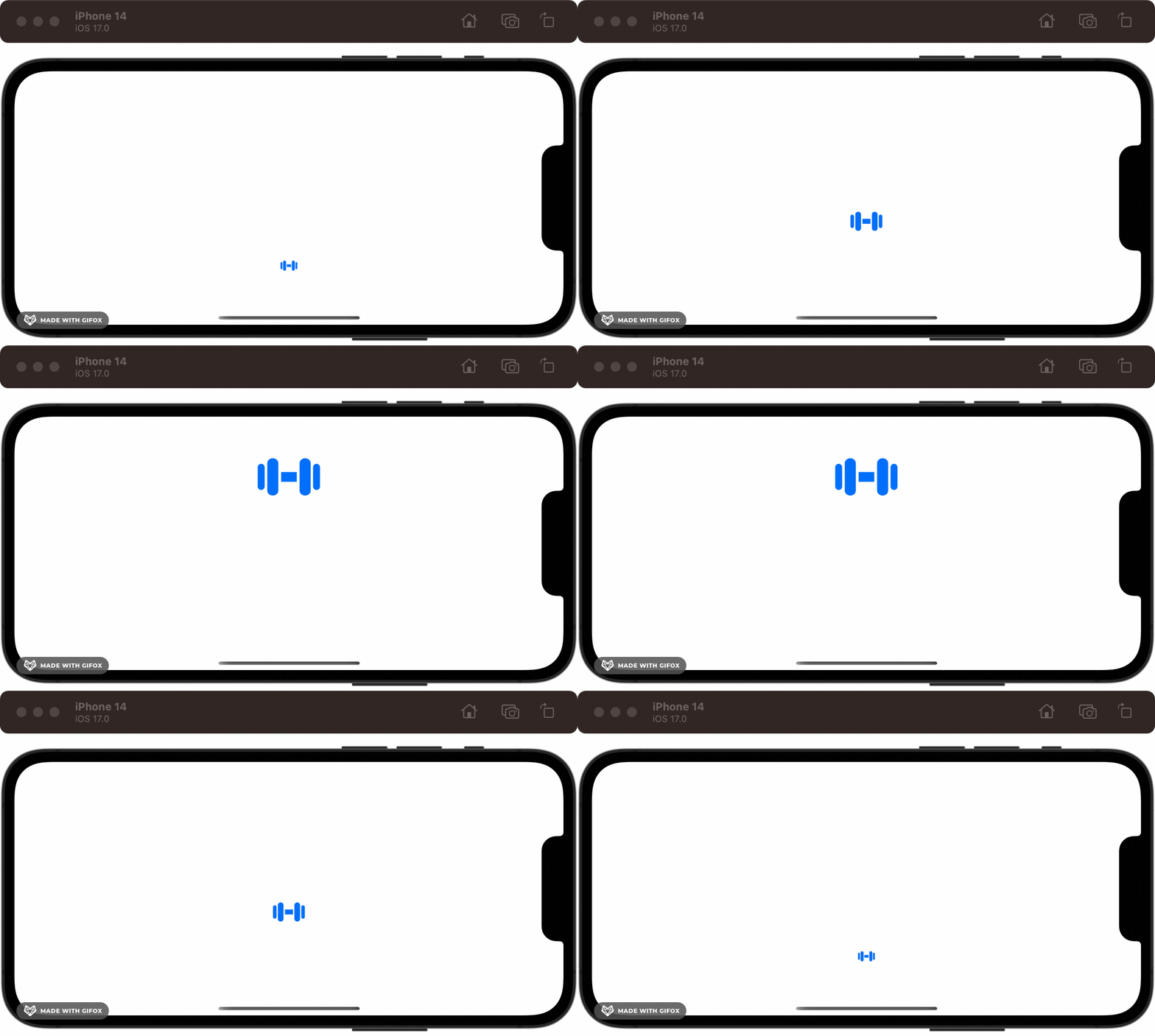
Through the Ages: Apple Animation APIs
Try out real code from NeXTSTEP to Mac OS X to SwiftUI
Subscribe to Jacob’s Tech Tavern for free to get ludicrously in-depth articles on iOS, Swift, tech, & indie projects in your inbox every two weeks.
Paid subscribers unlock Quick Hacks, my advanced tips series, and enjoy exclusive early access to my long-form articles.
I recently stumbled upon John Siracusa’s legendary Mac OS X reviews for the first time.
If you’re not in the loop, these were astonishingly detailed technical reviews of Apple’s major Mac OS X releases between 1999 and 2014. According to Ars Technica, where these were published, “a new OS X release started with Steve Jobs and ended with John Siracusa.” I voraciously delved into these reviews with a handy reading list as my tour guide.
What I found most fascinating — and what really inspired me to write this — was the piece on Core Animation from 2007. As a Swift baby, who barely remembers the Grand Renaming of Swift 3.0, Core Animation feels as fundamental as iOS itself, underpinning both UIKit and SwiftUI.
Learning of the existence of a world before Core Animation is like finding out that Santa isn’t real. What? You mean the pixels didn’t move around my screen by magic? It’s like learning that before the fire, we cooked food by rearranging its atoms by hand. Which, incidentally, is more or less what you had to do with pixels on first-generation GUIs.
In this article, I’m going to guide you on a journey through time to discover what was available to the Apple devs of each era, explain the problems solved by each successive generation of animation APIs, and even give you the opportunity to play with some real-life old-school animation code in this GitHub project.
Timeline
1989 — NeXTSTEP Generation: Display PostScript
2001 — Apple’s Renaissance: Quartz & OpenGL
2007 — The Modern Era: Core Animation
2014 — The Performance Age: Metal
2019 — The Declarative Revolution: SwiftUI
1989 — NeXTSTEP Generation: Display PostScript
Let’s first jump way back in history to understand the context of today’s Apple software. After being ousted from Apple in 1985, Steve Jobs founded NeXT, a rival computer company.
NeXT was hugely influential in object-oriented programming and graphical user interfaces and was eventually acquired by Apple. Their own NeXTSTEP operating system was merged with the Mac OS to become Mac OS X.
I didn’t want to shell out for a NeXTcube — or go down a huge rabbit hole to emulate 40-year-old hardware — therefore this section will show some code, but we won’t be able to run it. For everything else, there are real-life examples in the GitHub project that you can try out in Xcode!
The NeXTSTEP OS used a computer graphics engine developed by Adobe called Display PostScript. This introduced substantial advances over previous-generation display layers: it allowed text and graphics to be treated the same and introduced device-agnosticism through its higher-level API and page description language.
To give you a flavour of what this was like to work with, I bring you a charming snippet from the NeXT Computer Programming Manual:
# In the Application Kit, rectangles are specified as C structures of type NXRect. Since all coordinate values must be specified by floating-point numbers, it defines NXCoord as a float:

typedef float   NXCoord;

# A pair of NXCoord variables--one for the x coordinate and one for the y coordinate--designate a point:

typedef struct _NXPoint {
    NXCoord     x;
    NXCoord     y;
} NXPoint;

# A pair of NXCoord variables also designate the size of a rectangle:

typedef struct _NXSize {
    NXCoord     width;
    NXCoord     height;
} NXSize;

# The NeXT header file graphics.h (in the appkit subdirectory) combines NXPoint and NXSize structures to define the rectangle itself:

typedef struct _NXRect {
    NXPoint     origin;
    NXSize      size;
} NXRect;The manual also offers some simple code examples and PostScript APIs, such as…
Instantiating a rectangle:
NXRect rect = {{10.0, 10.0}, {50.0, 50.0}};Highlighting a rectangle on-screen:
NXHighlightRect(&rect);Checking whether two rectangles overlap:
BOOL overlap;
overlap = NXIntersectRect(&rect1, &rect2);
Creating a new rectangle for the intersection of overlapping rectangles:
NXRect  *smallrect;
smallrect = NXIntersectionRect(&rect1, &rect2);
Creating a new rectangle for the union of both rectangles, i.e., the rectangle containing both:
NXRect  *bigrect;
bigrect = NXUnionRect(&rect1, &rect2);While these commands were exceptionally low-level compared to what we are used to, they could compose together to create some pretty clean-looking systems, considering the constraints of 1989 hardware.
While code archaeology is good fun, I am starting to get dust in my butterfly keyboard. Before I cannot type, I will move on to some APIs that you can run on today’s hardware!
2001 — Apple’s Renaissance: Quartz & OpenGL
In 1996, Apple Computer acquired NeXT, Steve Jobs, and the NeXTSTEP operating system. This was the foundation for the original Mac OS X released in 2001.
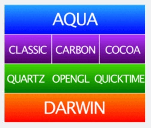
Mac OS X (pronounced OS-ten) instituted the fundamental building blocks for Apple’s future, and itself was a revolution of OS design that we take for granted today — all the way from its signature look-and-feel (Aqua) down to the kernel itself (Darwin).
The graphics layer of our O.G. OS has three components:
Quartz for low-level display and rendering, including Windows.
OpenGL for animation and 3D rendering.
Quicktime for audio and video (i.e., very out of scope).
Let’s go over Quartz and OpenGL in some detail to get a feel for what OS X programming was like back in 2001.
Quartz
Quartz, nowadays known more commonly as Core Graphics, forms the underlying display layer for Aqua, the design language at the top of our architecture diagram — a language that introduced the familiar Apple UX we know and love today. The Dock’s mouseover-to-expand and its famous genie animation when opening and closing a window were created using Quartz.
Quartz and Display PostScript were both “third generation” display layers — meaning they maintained information about the shapes drawn to the screen. Third-generation layers were also vector-aware, which helped power the easy transformation of on-screen objects. Quartz used Adobe’s PDF instead of PostScript as the underlying graphics representation language. This is a more advanced, open, standard which brought improvements across the board to colors, fonts, and interactivity.
Let’s draw something!
I’ll keep things simple with a basic Objective-C app — sorry to my Swift comrades, but that language isn’t released for another 13 years!
First, I create a header file for ATTAQuartzView.h A.K.A. my “Animation Through The Ages Quartz View” — name-spacing is important in Objective-C!
#import <Cocoa/Cocoa.h>

@interface ATTAQuartzView : NSView

@end
Then I implement the drawing logic in ATTAQuartzView.m.
#import "ATTAQuartzView.h"

@implementation ATTAQuartzView

- (void)drawRect:(NSRect)dirtyRect {
    [super drawRect:dirtyRect];
    CGContextRef context = (CGContextRef)[[NSGraphicsContext currentContext] graphicsPort];
    CGContextSetRGBFillColor(context, 1.0, 0.85, 0.35, 1.0);
    CGContextFillRect(context, CGRectMake(150, 150, 200, 200));
}

@end
I create a Core Graphics context, set a fill color, and fill a rectangle with this color.
Finally, to make life simple, I instantiate this view in the View Controller’s viewDidLoad method:
- (void)viewDidLoad {
    [super viewDidLoad];
    ATTAQuartzView *quartzView = [[ATTAQuartzView alloc] initWithFrame:NSMakeRect(0, 0, 400, 300)];
    [self.view addSubview:quartzView];
}
The result? A glorious golden square rendered to the window.
While
NSViewControllerdidn't really exist until Mac OS X Leopard (2007), I'm compromising to keep things simple with our Xcode project template.In reality, developers would create and manage
NSViewinstances directly, handling loading and transitions themselves.
Animating with Quartz
When you want to animate with Quartz, your options are rather limited.
Coming from Core Animation and SwiftUI, it may be a little more literal than you might be used to. We’re going to run some code on an NSTimer to directly update the frame of our on-screen shape.
First, we update ATTAQuartzView.h header file with a new side property:
#import <Cocoa/Cocoa.h>

@interface ATTAQuartzView : NSView

@property (nonatomic, assign) CGFloat side;

@end
And then, we can update our ATTAQuartzView.m implementation file to…
…set up a timer to modulate the rectangle’s side length over time:
@implementation ATTAQuartzView
{
    NSTimer *_timer;
    CGFloat _increment;
}

- (instancetype)initWithFrame:(NSRect)frameRect {
    self = [super initWithFrame:frameRect];
    if (self) {
        _side = 50.0;
        _increment = 3.0;
        _timer = [NSTimer scheduledTimerWithTimeInterval:1.0/60.0 target:self selector:@selector(tick:) userInfo:nil repeats:YES];
    }
    return self;
}

- (void)tick:(NSTimer *)timer {
    self.side += _increment;
    if (self.side > 200.0 || self.side < 10.0) {
        _increment *= -1.0;
    }
    [self setNeedsDisplay:YES];
}

//...

@end
...and redraw the shape based on this updated side length:
@implementation ATTAQuartzView

//...

- (void)drawRect:(NSRect)dirtyRect {
    [super drawRect:dirtyRect];
    CGContextRef context = (CGContextRef)[[NSGraphicsContext currentContext] graphicsPort];
    CGContextSetRGBFillColor(context, 1.0, 0.85, 0.35, 1.0);
    CGContextFillRect(context, CGRectMake(250 - self.side / 2.0,
                                          200 - self.side / 2.0,
                                          self.side,
                                          self.side)
                      );
}

@end
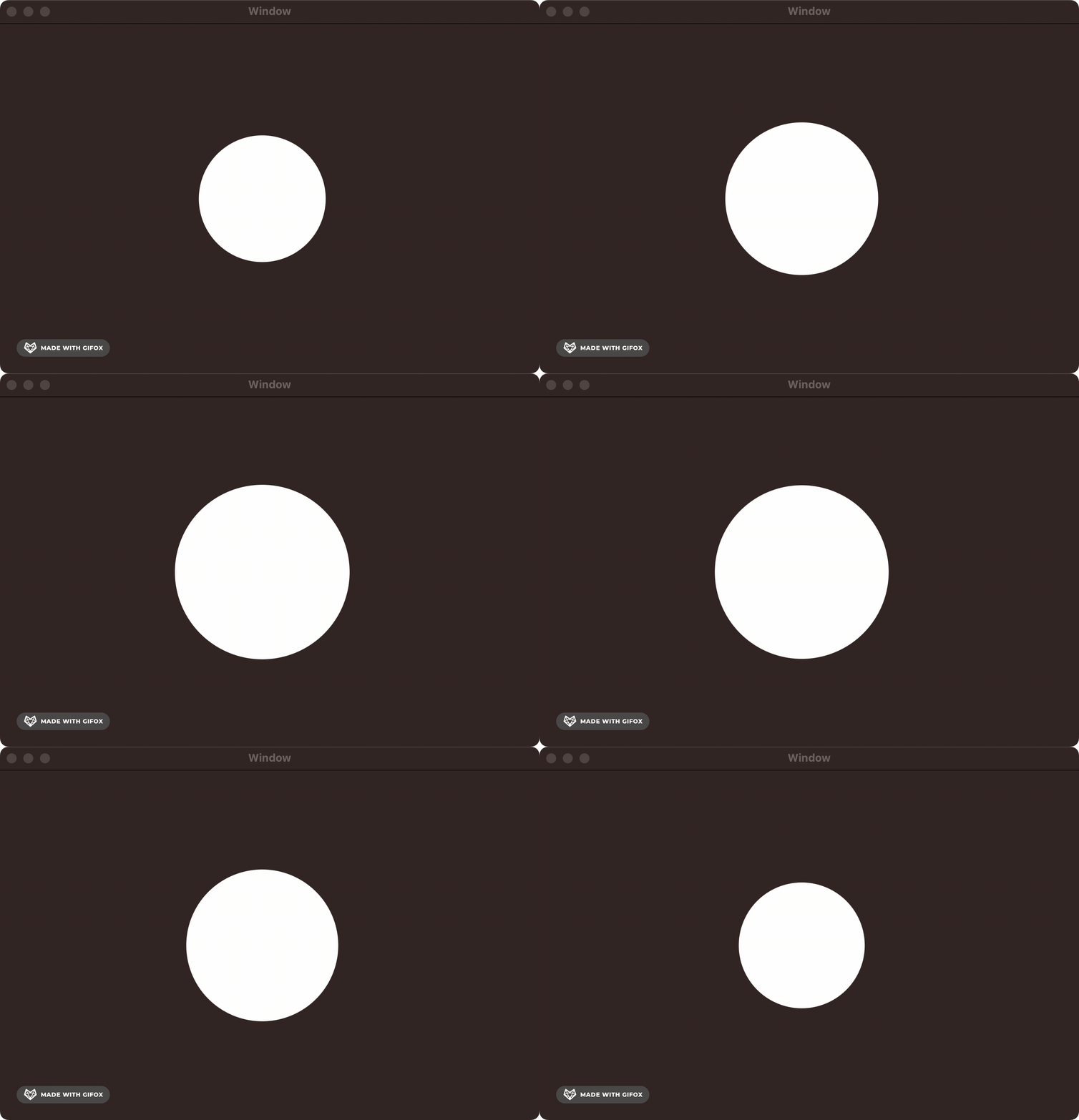
Our efforts are paying dividends in the form of a beautifully animated square.
The API is pretty straightforward when we’re just drawing or resizing a basic vector shape, but you can imagine how complex things could become if you wanted to move multiple items on-screen, deal with layering and opacity, or implement smoother animation timing curves.
OpenGL
OpenGL constituted the second pillar of the OS X graphics story. OpenGL is an open-source and cross-platform API for rendering vector graphics in 2D and 3D. It utilised hardware acceleration, which is a fancy way of saying it offloaded work to the GPU to render graphics. This made it the place to go for high-performance rendering on OS X (at least until 2002, when Quartz Extreme freed Quartz from the CPU).
OpenGL’s smooth 2D animation capabilities and lightning-fast GPU rendering allowed turn-of-the-century developers to create high-performance apps on hardware that would embarrass your grandmother. OpenGL used numerous modern optimisation techniques such as double-buffering — this displayed one frame while drawing the next, ensuring a smooth frame rate.
I’ve set up a simple Objective-C Mac App project in Xcode, which you’re welcome to follow along with! This 2004 tutorial from Apple proved invaluable in learning the ropes — and once again demonstrates how they were untouchable regarding documentation.
Creating our OpenGL drawing
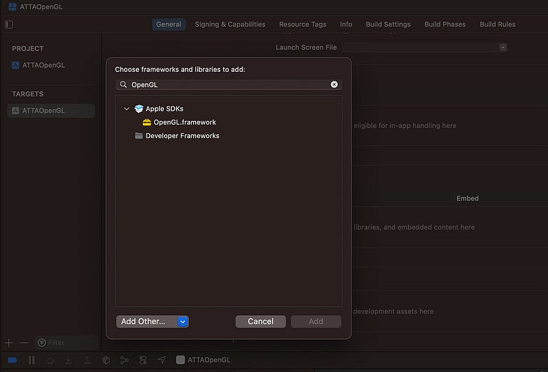
First, import OpenGL to Frameworks, Libraries, and Embedded Content in the Xcode General project settings:
Now, we can make a simple Obj-C header file, ATTAOpenGLView.h:
#import <Cocoa/Cocoa.h>

@interface ATTAOpenGLView : NSOpenGLView

- (void) drawRect: (NSRect) bounds;

@end
I hit a build warning before I even implemented anything:
@interface MyOpenGLView : NSOpenGLView“NSOpenGLViewis deprecated: first deprecated in macOS 10.14. Please useMTKViewinstead.”OpenGL was actually deprecated in MacOS Mojave, in favour of Metal, which we’ll come to later on. If you want to silence this warning, and the many more that will follow, throw up a
-DGL_SILENCE_DEPRECATIONcompiler flag in the Xcode project build settings.
Next, we write our implementation file, ATTAOpenGLView.m:
#include <OpenGL/gl.h>
#import "ATTAOpenGLView.h"

@implementation ATTAOpenGLView

- (void) drawRect : (NSRect) bounds
{
    glClearColor(0, 0, 0, 0);
    glClear(GL_COLOR_BUFFER_BIT);
    drawAnObject();
    glFlush();
}

static void drawAnObject(void)
{
    glColor3f(0.5f, 0.8f, 0.1f);
    glBegin(GL_TRIANGLES);
    {
        glVertex3f( -0.5, -0.5, 0.0);
        glVertex3f(  0.0,  0.5, 0.0);
        glVertex3f(  0.5, -0.5, 0.0);
    }
    glEnd();
}

@end
The drawRect(bounds:) method sets black as the background color, runs our drawing routine, and then calls glFlush() to send drawing instructions to the GPU.
drawAnObject() sets a green RGB color and draws out the vertices of a triangle. glBegin(GL_TRIANGLES) tells OpenGL that the vertices in the block should be grouped into threes and drawn on-screen as triangles. Since we give three vertices, that renders a solitary triangle.
Finally, to display the view on-screen, I set the main View Controller’s view as a new instance of ATTAOpenGLView as we did when looking at Quartz.
@implementation ViewController

- (void)viewDidLoad {
    [super viewDidLoad];
    self.view = [[ATTAOpenGLView alloc] init];
}
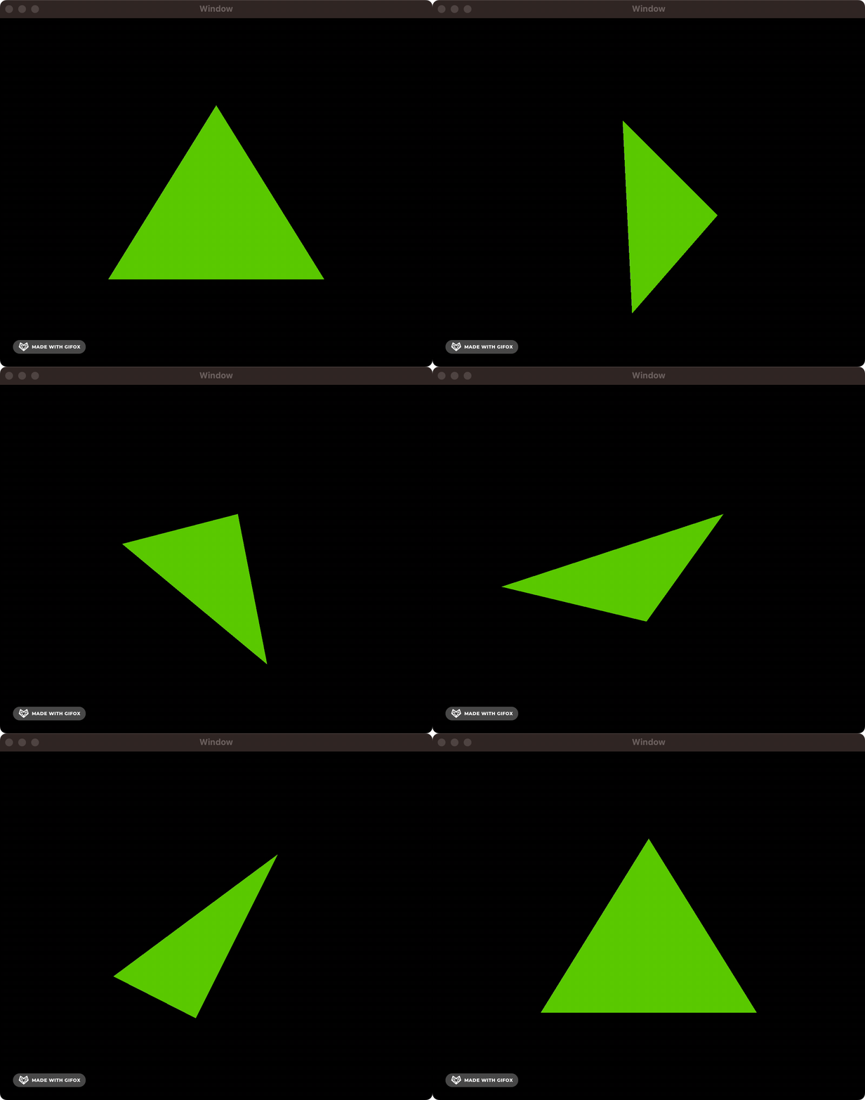
Finally, we are blessed with a beautiful green triangle drawn on-screen.
Let’s add some animation!
Like before, we could use an NSTimer to trigger our re-drawing logic, but a more performant approach is to use CVDisplayLink to sync updates up with your screen’s refresh rate, so we don’t waste clock cycles rendering frames that never appear on our screen.
You know what that means? It’s time for some more boilerplate! 😃
#include <OpenGL/gl.h>
#import <CoreVideo/CVDisplayLink.h>
#import "ATTAOpenGLView.h"

static CVReturn ATTADisplayLinkCallback(
    CVDisplayLinkRef displayLink,
    const CVTimeStamp* now,
    const CVTimeStamp* outputTime,
    CVOptionFlags flagsIn,
    CVOptionFlags* flagsOut,
    void* displayLinkContext)
{
    @autoreleasepool {
        ATTAOpenGLView* view = (__bridge ATTAOpenGLView*)displayLinkContext;
        [view performSelectorOnMainThread:@selector(markForRedisplay) withObject:nil waitUntilDone:NO];
        return kCVReturnSuccess;
    }
}

@implementation ATTAOpenGLView

- (void)markForRedisplay {
    [self setNeedsDisplay:YES];
}

- (instancetype)initWithFrame:(NSRect)frame {
    self = [super initWithFrame:frame];

    GLint swapInterval = 1;
    [[self openGLContext] setValues:&swapInterval forParameter:NSOpenGLCPSwapInterval];

    rotation = 0.0f;

    CVDisplayLinkCreateWithActiveCGDisplays(&displayLink);
    CVDisplayLinkSetOutputCallback(displayLink, &ATTADisplayLinkCallback, (__bridge void*)self);
    CVDisplayLinkStart(displayLink);

    return self;
}

- (void) dealloc {
    CVDisplayLinkStop(displayLink);
    CVDisplayLinkRelease(displayLink);
}

// ... our actual drawing code is all the way down here ...

@end
Long story short, upon initialisation, we are doing two things:
We set the “swap interval” on the
NSOpenGLViewto 1. This tells OpenGL to sync up its buffer swaps — i.e., its frame rate — with your screen’s refresh rate (a.k.a. its “v-sync” rate). Jargon aside, we tell OpenGL how many frames per second to calculate.We also tell
CoreVideoto send a callback each time our screen’s display refreshes. This callback executes a selector on the main thread (GCD isn’t invented for another eight years!), which marks the view for re-drawing. This ensures that the actual drawing to the screen happens at the correct time to avoid a screen refresh mid-calculation (this can cause a visual effect called tearing).
The rest of our implementation isn’t too hard. Each time setNeedsDisplay is set, the drawRect method is called, we update our rotation, and upgrade drawAnObject with some snazzy rotation logic:
@implementation ATTAOpenGLView

// ... CVDisplayLink boilerplate ...

- (void) drawRect:(NSRect)dirtyRect {
    [super drawRect:dirtyRect];
    rotation += 1.0f;
    glClearColor(0, 0, 0, 0);
    glClear(GL_COLOR_BUFFER_BIT);
    drawAnObject(rotation);
    glFlush();
}

static void drawAnObject(float rotation)
{
    glPushMatrix();
    glRotatef(rotation, 0.33333333333f, 1.0f, 0.5f);
    glColor3f(0.5f, 0.8f, 0.1f);
    glBegin(GL_TRIANGLES);
    {
        glVertex3f( -0.5, -0.5, 0.0);
        glVertex3f(  0.0,  0.5, 0.0);
        glVertex3f(  0.5, -0.5, 0.0);
    }
    glEnd();
    glPopMatrix();
}

@end
The big difference here is we’ve added glRotatef, which gives a very cool 90s-chic rotation along a 3D axis. Finally, glPushMatrix and glPopMatrix add and remove the transformation matrix to and from a stack — essentially ring-fencing the enclosed transformations so that nothing else on-screen is affected. Not exactly important in this one-shape case, but good manners.
We’re rewarded for our efforts with a high-tech 3D triangle.
2007 — The Modern Era: Core Animation
Let’s flash forward to 2007.

There is no App Store for another year.
Apple platform developers can only build for Mac OS X, but they have a problem.
Animation is hard work.
You saw how much ceremony was required to animate basic shapes in Quartz and OpenGL. Consider how tough it’d be for an indie dev to implement animations on the same level as the Dock genie.
In 2007, Mac OS X Leopard included a shiny new framework that changed everything: Core Animation.
Suddenly, Apple platform devs had a declarative framework to describe the end state they wanted, and the system would draw each frame to get to that state.
The framework would optimise the path to that state, utilising the tightly-integrated Mac hardware — including the GPU — to ensure a smooth transition. Core Animation’s sensible built-in defaults, in a single swoop, created a consistency of look-and-feel across all Apple platform apps.
Core Animation, sometimes called QuartzCore, worked using lightweight layers with several properties — including frame, border, filters, shadow, opacity, and mask — which could be animated virtually without effort. Core Animation also allowed video, Quartz, and OpenGL to operate together in a unified manner — everything graphical suddenly “just worked.”
This heralds the beginning of “The Modern Era” because Core Animation underpins much of the UI we write today, including AppKit, UIKit, and SwiftUI.
Developing with Core Animation
Now that we’re working directly with modern Core Animation layers, it’s pretty easy to work with the basic Xcode templates — we can even draw our CALayers in the default NSViewController from our project template. Follow along here, or clone the sample code yourself.
At the top of the ViewController.m, make sure to import Core Animation. On Mac and iOS, Core Animation is bundled with Core Image in a single framework called QuartzCore.
#import <QuartzCore/QuartzCore.h>
Now, everything we’re doing will sit in the viewDidLoad method of our view controller. As I mentioned before, NSView predates Core Animation by a lot. Therefore, we need to opt-in to make an NSView layer-backed by calling:
[self.view setWantsLayer:YES];
You might not recognise this if you’re more familiar with UIViewController, which is CALayer-backed by default.
Let’s go straight into it!
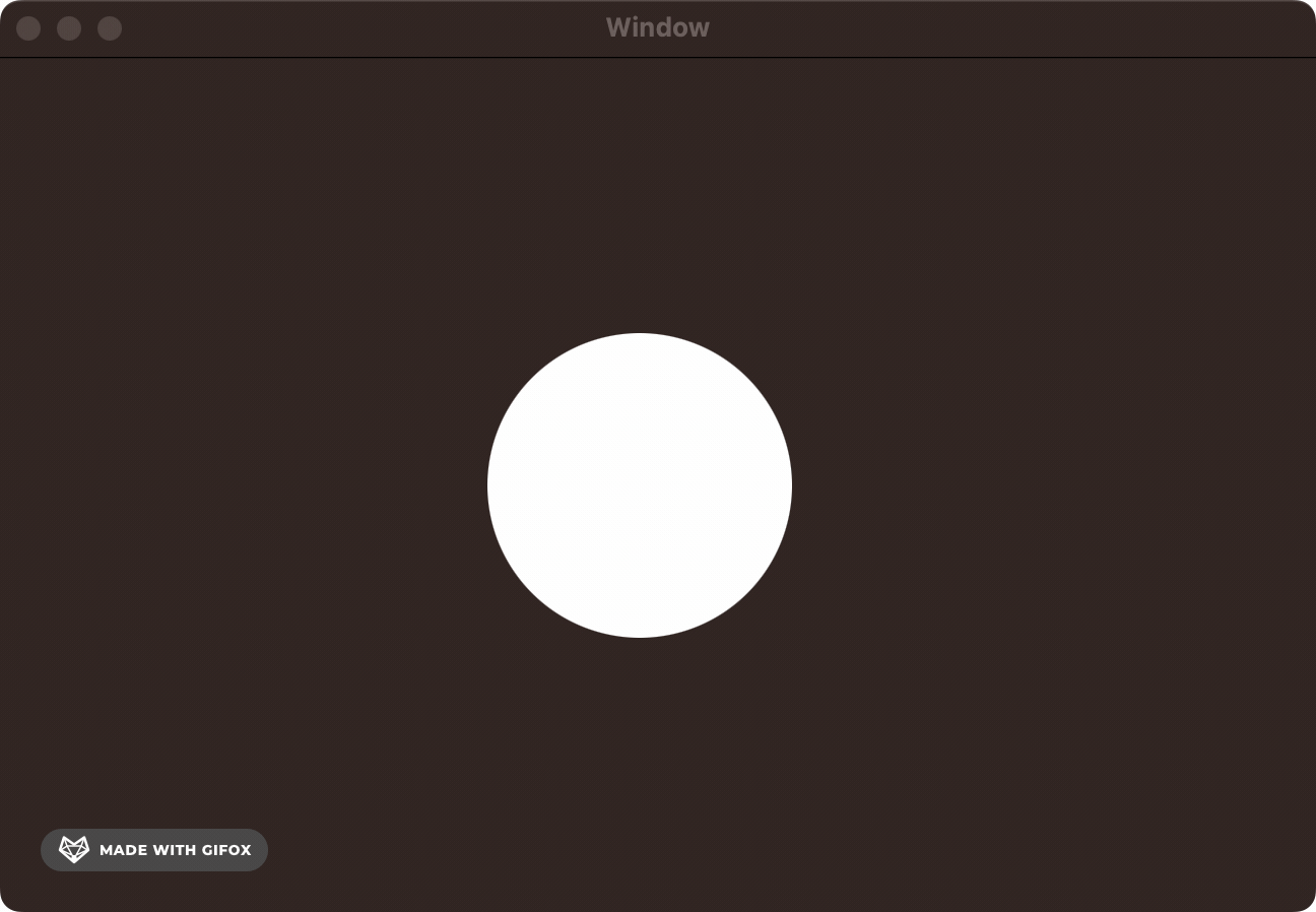
First, let’s draw our original CALayer — a simple circle.
// Circle shape layer
CAShapeLayer *circleLayer = [CAShapeLayer layer];
circleLayer.frame = CGRectMake(self.view.bounds.size.width/2, self.view.bounds.size.height/2, 150, 150);
circleLayer.cornerRadius = 75;
circleLayer.backgroundColor = [NSColor whiteColor].CGColor;
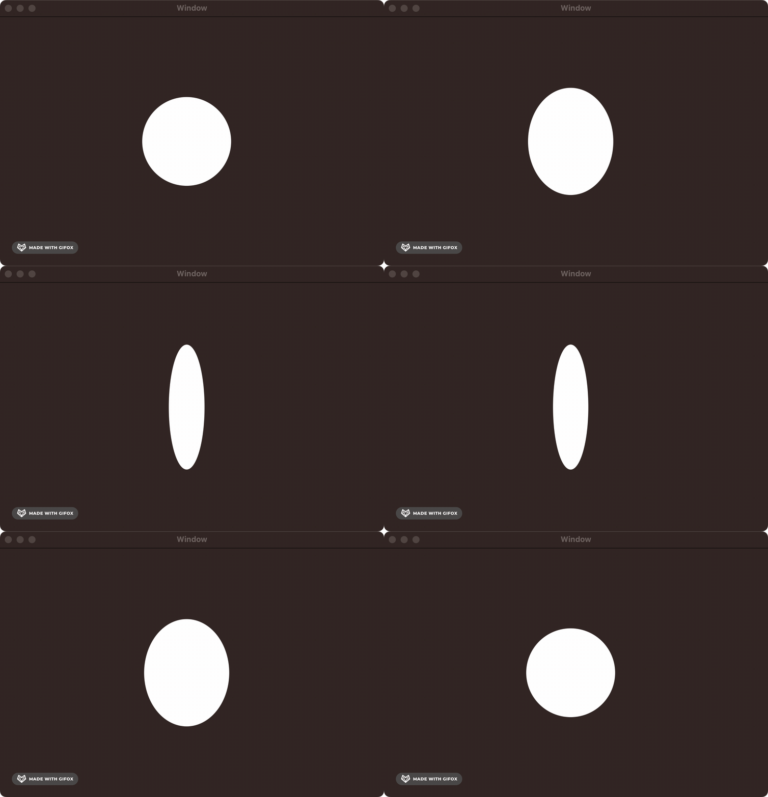
[self.view.layer addSublayer:circleLayer];Let’s add a simple scale animation so the circle grows and shrinks. We aren’t in previous generations of graphics APIs. In The Modern Era, you can specify your layer's start and end states, and Core Animation automatically calculates the frames required!
// Scale animation
CABasicAnimation *scaleAnimation = [CABasicAnimation animationWithKeyPath:@"transform.scale"];
scaleAnimation.fromValue = @1.0;
scaleAnimation.toValue = @1.5;
scaleAnimation.duration = 1.0;
scaleAnimation.autoreverses = YES;
scaleAnimation.repeatCount = HUGE_VALF;
[circleLayer addAnimation:scaleAnimation forKey:@"scaleAnimation"];
Frankly, I don’t think there’s much to explain here. We tell Core Animation what type of animation we want to create using [CABasicAnimation animationWithKeyPath:@”transform.scale”].
We set the initial and end state. We ask Core Animation to auto-reverse the animation — that is, go from start to end and back again. We tell it to repeat HUGE_VALF times.
HUGE_VALFis admittedly a little bit of cruft left over from the the heyday of C-based languages. It literally means “a huge float value.” For all intents and purposes, infinity.
Next, we add a rotation animation along the y-axis. Combined with the previous scale animation, this gives a 3D effect of the circle moving towards you on the screen, a bit like a flipped coin.
// Rotation animation
CABasicAnimation *circleYRotation = [CABasicAnimation animationWithKeyPath:@"transform.rotation.y"];
circleYRotation.toValue = [NSNumber numberWithFloat:M_PI * 2.0];
circleYRotation.duration = 4.0;
circleYRotation.repeatCount = HUGE_VALF;
[circleLayer addAnimation:circleYRotation forKey:@"rotationAnimation"];In Core Animation, you can apply both these animations to the layer, and it composes them together seamlessly.
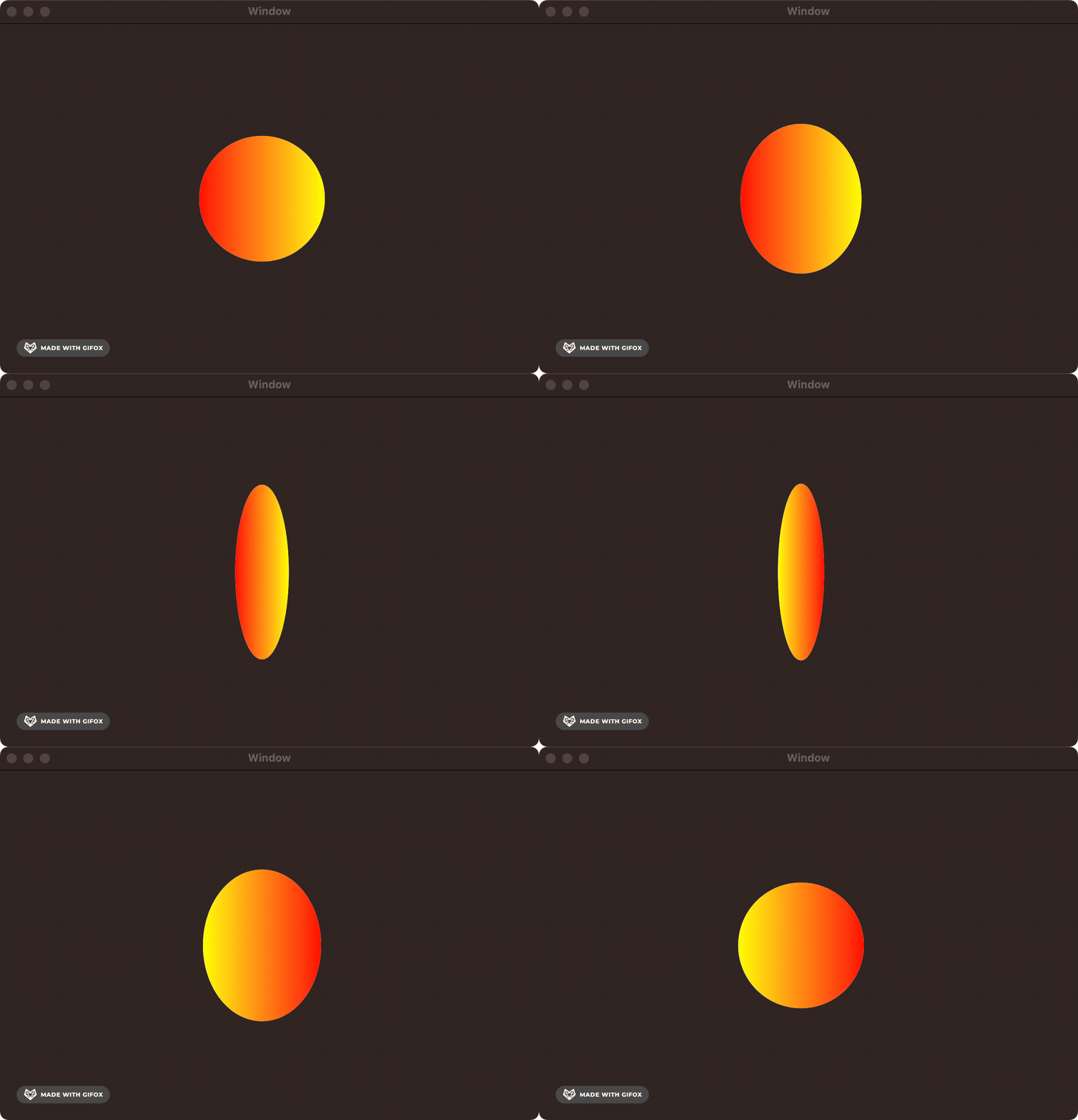
Next, we can add a sublayer to give a nice gradient effect and pin it to the bounds of the shape layer. Since it’s a sublayer, all the animations applied to the parent shape layer will seamlessly apply.
// Gradient sublayer
CAGradientLayer *gradientLayer = [CAGradientLayer layer];
gradientLayer.frame = circleLayer.bounds;
gradientLayer.colors = @[(__bridge id)[NSColor redColor].CGColor, (__bridge id)[NSColor yellowColor].CGColor];
gradientLayer.startPoint = CGPointMake(0, 0.5);
gradientLayer.endPoint = CGPointMake(1, 0.5);
gradientLayer.cornerRadius = circleLayer.cornerRadius;
[circleLayer addSublayer:gradientLayer];Finally, we can add another animation to modulate the gradient's color in the sublayer.
// Color change animation
CABasicAnimation *colorChange = [CABasicAnimation animationWithKeyPath:@"colors"];
colorChange.toValue = @[(__bridge id)[NSColor blueColor].CGColor, (__bridge id)[NSColor greenColor].CGColor];
colorChange.duration = 2.0;
colorChange.autoreverses = YES;
colorChange.repeatCount = HUGE_VALF;
[gradientLayer addAnimation:colorChange forKey:@"colorChangeAnimation"];After spending several days trying to parse out Display PostScript, Quartz and OpenGL, this gives me the same feeling as using SwiftUI for the first time in 2019. You just tell the CALayer what to do… and it just works 🥹.
2014 — The Performance Age: Metal
Fast-forward another seven years.
Steve Jobs is dead. iPhone has eaten the world.
Core Animation — and the UI framework built on top of it, UIKit — has spawned app giants like WhatsApp, Uber, and Candy Crush. For the engineers crafting cutting-edge mobile games, however, there was a creeping problem.
What’s wrong with Core Animation?
The high-level abstractions provided by Core Animation made it trivial to get started and build something great, but abstraction has a cost. Inherently, when you aren’t micromanaging every clock cycle, you’re trading efficiency for ergonomics.
Core Animation is phenomenal for cookie-cutter tasks like animating the opacity of UIButtons or dragging UITableView cells about. But what if you’re rendering a space shooter, a breakneck racing game, or a fully immersive farming simulator?
OpenGL ES (Open Graphics Library for Embedded Systems) was the standard for high-performance graphics APIs on iOS. It was a low-level 3D graphics API that gave fine-grained control over exactly what you were rendering to the screen.
OpenGL ES sounds great. What’s the problem?
OpenGL ES is a third-party library. This meant the software interfaces with the graphics hardware — the GPU — through a driver. Drivers are software that creates an interface to hardware via low-level instructions. These graphics library drivers themselves had to run on the CPU.
In the early 2010s, graphics chips were improving at a breathtaking clip. Their performance was finally starting to overtake that of CPUs. This led to a situation where the OpenGL ES driver, running on sluggish CPU hardware, bottlenecks the performance of graphics code running on the GPU.
Graphics engineers — the boffins building graphics engines like Unreal Engine or Unity — needed to get closer to the hardware. Closer to the Metal.
Key concepts of Metal
Before we start coding, let’s ensure we’re all on the same page with a brief conceptual overview of how the Metal framework actually works — it’ll be a little overwhelming if you’ve never worked with graphics pipelines before, and that’s okay.
Shaders are small functions that run on the CPU to handle rendering. The name is historical — back in prehistoric OpenGL days, they just controlled the shading of vector shapes.
Vertex shaders transform 3D coordinates in vector space to 2D coordinates, which can map nicely to a plane — such as your screen.
Fragment shaders, a.k.a. pixel shaders, color the individual pixels on a screen when a shape is rasterised — that is, transformed from a 2D vector image to dots on a screen.
Metal Shading Language is the language we use to write these shaders. It’s based on C++ 2011 — with several language features trimmed down and some graphics-focused features mixed in.
MTLDeviceis an abstraction in MetalKit representing the hallowed hardware of the GPU itself.MTLCommandBufferis the place where drawing instructions are stored before they’re piped over to the hardware for massively parallelised execution.MTLCommandQueuemanages the above command buffers while maintaining order of execution.
Does your brain hurt?
Great, that means you’re learning!
Let’s write some code
Since we’re finally in ✨ the future ✨, we can create an iOS app that runs on Swift. Code along with me, or check out the sample project yourself.
While I really wanted to write this section in Swift 1.0, which was the state-of-the-art in 2014, it isn’t possible to get a build of Xcode that both (1) contains the Swift 1.0 runtime and (2) runs on MacOS Ventura.
I could argue that I want to let you run the projects for yourself, but frankly, I’m just a bit lazy.
As you’ll be familiar with by now, let’s start by adding the Metal and MetalKit frameworks to the Xcode project:
Now we come to the main event — adding a Shaders.metal file to your project. This is the C++-based Metal Shading Language I mentioned before. It’s pretty terse, packing a lot of semantics into a few lines.
#include <metal_stdlib>
using namespace metal;

vertex float4 vertex_main(constant float4* vertices [[buffer(0)]], uint vid [[vertex_id]]) {
    return vertices[vid];
}

fragment float4 fragment_main() {
    return float4(1, 0, 0, 1);
}metal_stdlibcontains the helper functions and types that turn out useful for writing shaders.using namespace metalallows us to namespace and prevents us from needing to prefix all our methods with the Metal framework name.The
vertex_mainfunction is prefixedvertex float4, denoting it as the vertex shader, which maps 3D coordinates to a screen and returns a 4D vector — that is four numbers. This tells the GPU where to look for the vector data it wants to draw.The
fragment_mainfunction is the fragment shader that colors the pixels on-screen— here, it simply returns a red color in RGB format.
The Swift APIs for Metal
You can relax a little. We’re coming back to more familiar-looking Swift APIs for now. First, we set up MetalView.swift:
final class MetalView: MTKView {

    var commandQueue: MTLCommandQueue!
    var pipelineState: MTLRenderPipelineState!

    override init(frame frameRect: CGRect, device: MTLDevice?) {
        super.init(frame: frameRect, device: device)
        commandQueue = device?.makeCommandQueue()!
        createRenderPipelineState()
        clearColor = MTLClearColor(red: 0.8, green: 0.8, blue: 0.8, alpha: 1.0)
    }

    required init(coder: NSCoder) {
        fatalError()
    }

// ...
An MTKView is initialised with a simple rectangular frame and a MTLDevice. As I mentioned earlier, this is an object that represents the GPU.
Instantiating this view is dead easy now that we’re working with UIKit — you can add this view into the project template’s ViewController.swift:
import UIKit
import MetalKit

final class ViewController: UIViewController {

    var metalView: MetalView!

    override func viewDidLoad() {
        super.viewDidLoad()

        guard let metalDevice = MTLCreateSystemDefaultDevice() else {
            fatalError("Metal is not supported on this device")
        }

        metalView = MetalView(frame: view.bounds, device: metalDevice)
        view.addSubview(metalView)
    }
}
The MTLCreateSystemDefaultDevice method in MetalKit allows the framework to locate the GPU hardware and return a metalDevice object representing it. With it, we initialise our MetalView and set up our rendering pipeline.
To get our Metal rendering kicked off, we need to fill out two more non-trivial components in our MetalView. createRenderPipelineState() and draw(_ rect: CGRect).
First, we’ll set up the render pipeline:
func createRenderPipelineState() {
    let library = device?.makeDefaultLibrary()
    let vertexFunction = library?.makeFunction(name: "vertex_main")
    let fragmentFunction = library?.makeFunction(name: "fragment_main")

    let pipelineDescriptor = MTLRenderPipelineDescriptor()
    pipelineDescriptor.vertexFunction = vertexFunction
    pipelineDescriptor.fragmentFunction = fragmentFunction
    pipelineDescriptor.colorAttachments[0].pixelFormat = .bgra8Unorm

    pipelineState = try? device?.makeRenderPipelineState(descriptor: pipelineDescriptor)
}
Here, we tell the GPU which functions from Shaders.metal to use for the vertex and fragment shaders. We then set up a rendering pipeline that takes vertices and colors and processes them into on-screen pixels.
While there’s a lot to cover here, this is a pretty simple example — high-end Metal game engines will also process textures, lighting, tesellation, morphing, visual effects, anti-aliasing, and more in their rendering pipelines.
Finally, we override draw(_ rect: CGRect) to actually set up our vector drawing.
override func draw(_ rect: CGRect) {
    guard let drawable = currentDrawable,
          let renderPassDescriptor = currentRenderPassDescriptor else { return }

    let commandBuffer = commandQueue.makeCommandBuffer()!

    let renderEncoder = commandBuffer.makeRenderCommandEncoder(descriptor: renderPassDescriptor)!
    renderEncoder.setRenderPipelineState(pipelineState)

    let vertices: [SIMD4<Float>] = [
        [-0.8, -0.4, 0.0, 1.0],
        [ 0.8, -0.4, 0.0, 1.0],
        [ 0.0,  0.4, 0.0, 1.0]
    ]

    renderEncoder.setVertexBytes(vertices, length: vertices.count * MemoryLayout<SIMD4<Float>>.size, index: 0)
    renderEncoder.drawPrimitives(type: .triangle, vertexStart: 0, vertexCount: 3)
    renderEncoder.endEncoding()
    commandBuffer.present(drawable)
    commandBuffer.commit()
}
This does a few things, but primarily the following:
Ensure there is a
drawablesurface to render on (usually the screen).Create a new command buffer on which to place commands for the GPU.
Set up an array of 4D vectors to represent vertices of a triangle. This matches our vertex shader’s method argument in
Shaders.metal.Tells the render to draw a
.trianglebased on the vertices given — if you paid attention earlier, this works pretty similarly to our OpenGL rendering process withglBegin(GL_TRIANGLES).Finally, we tell the buffer we’re done and tell it to send our instructions to the GPU for execution with
commit.
This tutorial might have been a little too in-depth, but hey, after 4,500 words, we’re committed now. And look at this incredible result!
That’s right, folks. A red triangle on a grey background.
If you get the impression that we’re taking a step back in terms of abstraction, you’re correct — since Metal is a lower-level API than Core Animation, we have to be a little more specific about what we want the hardware to do, which means more basic, low-level, imperative operations that get specific about exactly what the hardware does.
On the contrary, the declarative syntax of Core Animation states what we want to do and trusts the system to render the state changes in the way it sees fit.
Let’s put the pedal to the Metal
…and introduce some animation.
First, we update the shader functions in Shaders.metal to handle time in addition to the 4D vertex. This spruced-up version will modulate its color along a series of synchronised sine waves.
#include <metal_stdlib>
using namespace metal;

struct VertexOut {
    float4 position [[position]];
    float time;
};

vertex VertexOut vertex_main(constant float4* vertices [[buffer(0)]], uint vid [[vertex_id]], constant float &time [[buffer(1)]]) {
    VertexOut out;
    out.position = vertices[vid];
    out.time = time;
    return out;
}

fragment float4 fragment_main(VertexOut in [[stage_in]]) {
    float r = sin(in.time) * 0.5 + 0.5;
    float g = sin(in.time + 2.0) * 0.5 + 0.5;
    float b = sin(in.time + 4.0) * 0.5 + 0.5;
    return float4(r, g, b, 1.0);
}
Let’s also update our MetalView.swift to send the time argument to these shaders. Update the properties and the initializer:
final class MetalView: MTKView {

    var commandQueue: MTLCommandQueue!
    var pipelineState: MTLRenderPipelineState!
    var displayLink: CADisplayLink!
    var startTime: CFTimeInterval?
    var time: Float = 0.0

    override init(frame frameRect: CGRect, device: MTLDevice?) {
        super.init(frame: frameRect, device: device)
        commandQueue = device?.makeCommandQueue()!
        createRenderPipelineState()
        clearColor = MTLClearColor(red: 0.8, green: 0.8, blue: 0.8, alpha: 1.0)
        displayLink = CADisplayLink(target: self, selector: #selector(update))
        displayLink.add(to: .current, forMode: .default)
    }

//...
Here, we’re revisiting our old friend from 2001, CADisplayLink, with a slightly more cuddly API this time. The new update method ensures the display resets and redraws our shape each time the screen wants to refresh:
@objc func update(displayLink: CADisplayLink) {
    if startTime == nil {
        startTime = displayLink.timestamp
    }

    let elapsed = displayLink.timestamp - startTime!
    time = Float(elapsed)

    self.setNeedsDisplay()
}
The boilerplate we wrote to set up our rendering pipeline in createRenderPipelineState method is entirely unchanged— and the draw logic doesn’t need much wrangling:
override func draw(_ rect: CGRect) {
    guard let drawable = currentDrawable,
          let renderPassDescriptor = currentRenderPassDescriptor else { return }

    let commandBuffer = commandQueue.makeCommandBuffer()!

    let renderEncoder = commandBuffer.makeRenderCommandEncoder(descriptor: renderPassDescriptor)!
    renderEncoder.setRenderPipelineState(pipelineState)

    let vertices: [SIMD4<Float>] = [
        [-0.8, -0.4, 0.0, 1.0],
        [ 0.8, -0.4, 0.0, 1.0],
        [ 0.0,  0.4, 0.0, 1.0]
    ]

    renderEncoder.setVertexBytes(vertices, length: vertices.count * MemoryLayout<SIMD4<Float>>.size, index: 0)
    renderEncoder.setVertexBytes(&time, length: MemoryLayout<Float>.size, index: 1)
    renderEncoder.drawPrimitives(type: .triangle, vertexStart: 0, vertexCount: 3)
    renderEncoder.endEncoding()
    commandBuffer.present(drawable)
    commandBuffer.commit()
}
The only real difference here is adding the &time argument to a new call to renderEncoder.setVertexBytes, which allows the fragment shader to modulate the color with time.
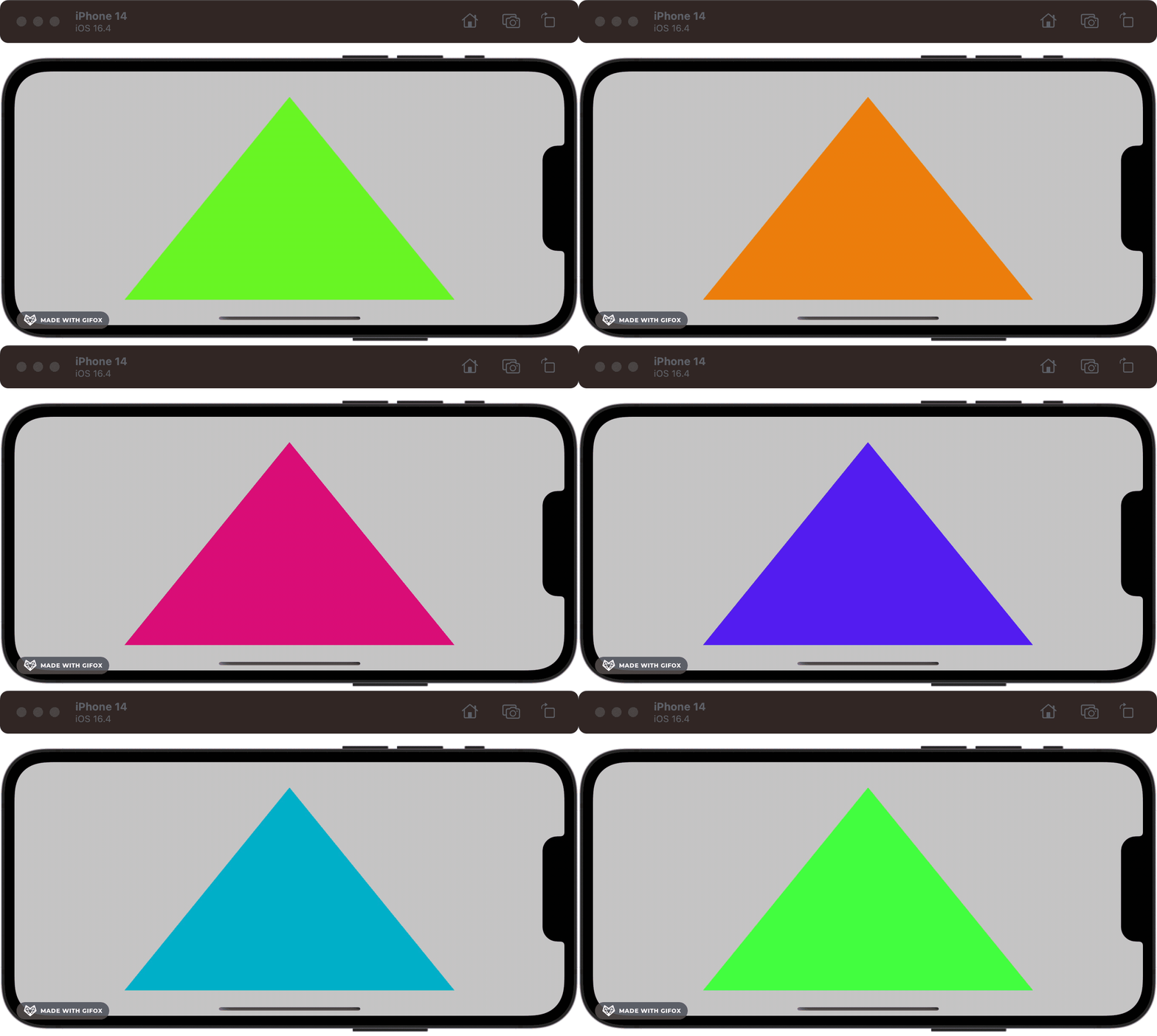
The result? A bona-fide radioactive Dorito. The GPU doesn’t break a sweat.
Going further
Now that we have our CADisplayLink logic configured in our MetalView, and send a time reference to the shader via renderEncoder.setVertexBytes(&time, length: MemoryLayout<Float>.size, index: 1), we can implement more animation simply by updating the code for the vertex shader:
float4x4 rotationMatrix(float angle, float3 axis) {
    float c = cos(angle);
    float s = sin(angle);
    float3 normalized = normalize(axis);
    float3 temp = (1.0 - c) * normalized;

    float4x4 rotation = {
        {c + temp.x * normalized.x, temp.x * normalized.y + s * normalized.z, temp.x * normalized.z - s * normalized.y, 0.0},
        {temp.y * normalized.x - s * normalized.z, c + temp.y * normalized.y, temp.y * normalized.z + s * normalized.x, 0.0},
        {temp.z * normalized.x + s * normalized.y, temp.z * normalized.y - s * normalized.x, c + temp.z * normalized.z, 0.0},
        {0.0, 0.0, 0.0, 1.0}
    };

    return rotation;
}

vertex VertexOut vertex_main(constant float4* vertices [[buffer(0)]], uint vid [[vertex_id]], constant float &time [[buffer(1)]]) {
    VertexOut out;
    float4x4 rotation = rotationMatrix(time, float3(0.0, 0.0, 1.0));
    out.position = rotation * vertices[vid];
    out.time = time;
    return out;
}
Here, we’re creating a rotation matrix that varies with time to display a rotation on the z-axis. Since the triangle’s dimensions are based on the screen’s frame, this results in a surprisingly cool acid trip.
Remember, readers — being an expert at 3D graphics frameworks such as Metal, OpenGL ES, or Vulkan, is generally not required to build great iOS apps. It isn’t even directly used in 3D games. The sacred knowledge of Metal is most often the preserve of game engine creators (and, more recently, machine learning engineers).
If you weren’t familiar with Metal before, the esoteric nature of this segment is a testament to the achievements of Core Animation (and, to a lesser extent, Quartz): The separation of low-level graphics expertise and app development. You don’t need this knowledge today to create amazing software, but you might be building on top of these tools without knowing it.
After our odyssey through the history of Apple’s graphics and animation APIs, it’s only fitting that we look to the future. I speak, of course…
…of SwiftUI.
2019 — The Declarative Revolution: SwiftUI
Let’s set the stage one last time as we flash toward the present.
In 2013, React slammed the heft of Facebook face-first into the constantly-changing mess that was frontend in the early 2010s. React treated UI as a function of state, introduced the virtual DOM for high performance, and worked with component-based, compositional rendering.
Apple, which had witnessed the gradual neutering of Microsoft Windows by the web in the 2000s, had been doing everything in its power to kill the web as a viable platform on iOS.
But there were barbarians at the gates!
Facebook’s React Native introduced cross-platform app compilation using standard React syntax in 2015. Shortly after, in 2017, Google introduced Flutter, which used the Dart language to allow React-style UI development across web, Android, and iOS. Both approaches came packed with developer-friendly ergonomics like hot-reloading UI.
This competition, coupled with the uncomfortable platform split across iPhone (UIKit), Mac (AppKit), and Apple Watch (WatchKit), native app development was beginning to look like a bad long-term bet for new engineers.
SwiftUI was announced as the future of Apple platform UI development in 2019, spawning years of arguments about whether it was production-ready (it is).
SwiftUI was the declarative framework to create UI across all Apple platforms. It was built on Core Animation and Metal foundations and made animation far easier than ever before.
If you’ve been following the article, and we aren’t yet in the 2040s rendering your Vision Pro projects with Generative AR, you don’t need me to tell you how to set up a SwiftUI app.
Let’s get right to it.
As always, my sample code for this mini-project is available on GitHub.
SwiftUI 1.0: Basic animations
Looking through the SFSymbols catalogue for inspiration, I stumbled upon this number, dumbbell.fill. A sporty theme would work great here!
In SwiftUI, animations are truly a function of state. When we animate a state change, the UI, which depends on the state, naturally animates to represent the new state. This level of declarative-ness could make Core Animation blush!
We can get started in ContentView.swift with a simple dumbbell image at the bottom of the screen.
import SwiftUI

struct ContentView: View {

    var body: some View {
        Image(systemName: "dumbbell.fill")
            .imageScale(.large)
            .foregroundColor(.accentColor)
            .frame(maxWidth: .infinity, maxHeight: .infinity, alignment: .bottom)
    }
}
I want to create a looping animation that creates the effect of doing alternating reps with two dumbbells. This would involve two components:
A vertical translation
Image scaling
We can use scaleEffect modifier, along with the alignment property of the frame modifier to achieve this.
struct ContentView: View {

    @State private var isAnimated: Bool = false

    var body: some View {
        Image(systemName: "dumbbell.fill")
            .imageScale(.large)
            .foregroundColor(.accentColor)
            .scaleEffect(isAnimated ? 4 : 1)
            .frame(maxWidth: .infinity,
                   maxHeight: .infinity,
                   alignment: isAnimated ? .top : .bottom)
            .animation(loopingAnimation, value: isAnimated)
            .onAppear {
                isAnimated = true
            }
    }

    private var loopingAnimation: Animation {
        .easeInOut(duration: 0.75)
        .repeatForever(autoreverses: true)
    }
}
We create an implicit animation using the animation modifier. This tells the SwiftUI rendering engine to animate a state change when the specified value updates. Here, we’re just using a simple isAnimated property as the value we sets in onAppear; and using repeatForever on our Animation to ensure it loops. Now we get a clean lifting effect:
Going further, we can make this look even snazzier and give the code a clean-up.
If you know anything about me, you’ll know I love to use enums where I can. Here, I create a Rep enum to represent the state; and store the visual effects I want for each state.
enum Rep {
    case left
    case right

    mutating func lift() {
        switch self {
        case .left: self = .right
        case .right: self = .left
        }
    }

    func scale(rep: Rep) -> Double {
        self == rep ? 4 : 1
    }

    func alignment(rep: Rep) -> Alignment {
        self == rep ? .top : .bottom
    }
}
Since I want to make two dumbbells, the effect will depend on which side I lift in my rep. The scaleEffect and alignment will be larger and higher when the rep matches the dumbbell’s side.
Here’s the final SwiftUI view:
struct DumbbellView: View {

    @State private var rep: Rep?

    var body: some View {
        HStack {
            dumbbell(side: .left)
            dumbbell(side: .right)
        }
        .padding(40)
        .background(Color.indigo)
        .onAppear {
            if rep == nil {
                rep = .left
                rep?.lift()
            }
        }
    }

    private func dumbbell(side: Rep) -> some View {
        Image(systemName: "dumbbell.fill")
            .imageScale(.large)
            .foregroundColor(.white)
            .scaleEffect(side.scale(rep: rep ?? .left))
            .frame(maxWidth: .infinity,
                   maxHeight: .infinity,
                   alignment: side.alignment(rep: rep ?? .left))
            .animation(loopingAnimation, value: rep)
    }

    private var loopingAnimation: Animation {
        .easeInOut(duration: 0.75)
        .repeatForever(autoreverses: true)
    }
}
To make two dumbbells, we’ve refactored our SwiftUI code to create a dumbbell view via a helper method, initializing an icon for each side. Since we use repeatForever in our Animation, we only need to change the state once, using onAppear, to cause the animated state change to continue forever.
Now we’ve produced a truly gainful animation.
SwiftUI 2.0: matchedGeometryEffect
SwiftUI 1.0 was both revolutionary and highly flawed. While introducing UI as a function of state to the native iOS world and a beautiful declarative syntax, navigation was completely busted, and many key features were missing.
2020’s release on iOS 14 fixed many of these problems and introduced some great new features — my favourite being matchedGeometryEffect. This creates an animation effect similar to Keynote’s Magic Move.
matchedGeometryEffect requires you to set unique identifiers between elements, which allows SwiftUI to maintain an understanding of the view’s identity even between different subviews in a hierarchy. The rendering engine captures the geometry — that is, position and size — and creates a smooth motion that interpolates the changes between the two views when a transition happens.
Here’s some example code in CourtsideView, demonstrating a sports team swapping sides at half-time. I’ll show the key snippets, but check out my GitHub for the full code.
import SwiftUI

struct CourtsideView: View {

    @Namespace private var animation
    @State private var isFirstHalf: Bool = true

    var body: some View {
        VStack {
            HStack {
                if isFirstHalf {
                    team(name: "Red Team", color: .red, flipped: false)
                    Spacer()
                    team(name: "Green Team", color: .green, flipped: true)
                } else {
                    team(name: "Green Team", color: .green, flipped: false)
                    Spacer()
                    team(name: "Red Team", color: .red, flipped: true)
                }
            }
        }
    }

    private func team(name: String, color: Color, flipped: Bool) -> some View {
        Text(name)
            .foregroundColor(color)
            .font(.title)
            .fontWeight(.bold)
            .rotationEffect(.radians(flipped ? (.pi / 2) : (-.pi / 2)))
            .matchedGeometryEffect(id: name, in: animation)
    }
}
There are a few core concepts here:
@Namespace private var animationsets up a global namespace for SwiftUI to identify our views.We create two arrangements: in the first half, red team is at the leading edge of the
HStackand the green team is on the trailing end; this is swapped after the first half — i.e., whenisFirstHalfis toggled tofalse.The
teamhelper function helps create a small view showing our team name, color, and rotational arrangement.Finally,
matchedGeometryEffect(id: name, in: animation)on each team tells the global namespace the identity of the view; so it can be animated smoothly when the half changes.
Note that I said
leadingandtrailing, not right and left —HStackswitches these around when using a left-to-right language!
Our half-time button toggles the @State property with an explicit spring animation. This means that everything in our view that depends on the isFirstHalf property gets animated when it changes.
private var halfTimeButton: some View {
    Button(action: {
        withAnimation(.spring()) {
            isFirstHalf.toggle()
        }

    }, label: {
        Label("Half Time", systemImage: "flag.filled.and.flag.crossed")
    })
}
Here, we can see the half-time button in action to swap the teams’ sides:
I’m only scratching the surface of the power of matchedGeometryEffect here. It shows its true potential when you use it to create a hero image animation during a view transition, allowing a small image in a collection to seamlessly expand into a full-size header when you view a details screen.
SwiftUI 2023: Keyframe animations
The latest SwiftUI release is the biggest change for animations yet. Primarily, it introduces the long-awaited keyframe animation to give developers and UI designers fine-grained control. It’s yet to be shown if this will kill Lottie once and for all.
The concept of a “keyframe” harkens back to the old-school Disney animation era. Senior artists would draw the main points of motion — the “key frames” — and more junior animators would fill in the many frames between these key poses.
Keyframes in software are much the same: we define specific points along a timeline, setting values for properties such as position, scale, and opacity. The software, acting as our trusty junior animator, interpolates between these sets of values in the keyframes and computes all the frames to render in between.
For our final example, let’s work on our deadlift.
import SwiftUI

struct DeadliftView: View {

    struct Transformation {
        var yScale = 1.0
    }

    var body: some View {
        Image(systemName: "figure.strengthtraining.traditional")
            .keyframeAnimator(initialValue: Transformation(),
                              repeating: true,
                              content: { content, transformation in
                content
                    .scaleEffect(y: transformation.yScale, anchor: .bottom)
            },
                              keyframes: { _ in
                KeyframeTrack(\.yScale) {
                    LinearKeyframe(0.6, duration: 0.25)
                    LinearKeyframe(1.0, duration: 0.25)
                    LinearKeyframe(1.4, duration: 0.25)
                    LinearKeyframe(1.0, duration: 0.25)
                }
            })
    }
}
There’s a substantial quantity of new API here, so I’ve intentionally made the animation itself as dull as possible. Hence, it’s easy to follow along with the KeyframeTrack as we perform a deadlift rep:
For the first
duration: 0.25seconds, we crouch down — transforming ouryScalevalue in theTransformationstruct from the initial 1.0 to 0.6. ThescaleEffect(y: transformation.yScale)view modifier applies to our content and causes the initial dip.We then stand up with the barbell, going from a
yScaleof 0.6 to 1.0 and then 1.4 over 0.5 seconds. I’ve used two separate linear keyframes here, so the durations all match up, but we could just as easily have used a singleLinearKeyframe(1.4, duration: 0.5)to do this in one.Finally, we return to our original scale — 1.0, in the final 0.25 seconds to loop smoothly.
The keyframeAnimator modifier is the star of the show here, setting up the whole shebang with the following arguments:
initialValuetakes a genericValuewhich holds all the properties we want to animate — in this case, theTransformationstruct initialized with our initial values.repeating: trueto keep our keyframe animation looping indefinitelycontentis aViewBuilderclosure where we apply transformations to the view (content) using the interpolated value of the transformations between each keyframe (transformation)keyframesto define how the transformation values will be changed over time — this is where we set up theKeyframeTracks, which allow separately timed transformations over the properties we choose.
We can spruce up the animation with an additional yTranslation property in our Transformation struct:
struct Transformation {
    var yScale = 1.0
    var yTranslation = 0.0
}
We add an additional offset modifier to the content in our keyframeAnimator:
content
    .scaleEffect(y: transformation.yScale, anchor: .bottom)
    .offset(y: transformation.yTranslation)
And lastly, we add another KeyframeTrack with some new ways to interpolate the translation:
KeyframeTrack(\.yTranslation) {
    LinearKeyframe(20, duration: 0.25)
    SpringKeyframe(-40, duration: 0.5, spring: .snappy)
    CubicKeyframe(0, duration: 0.25)
}
And now our resident strongman is getting a leg workout at the same time:
I’m barely scratching the surface since WWDC 2023 introduced an astonishing amount of advanced animation APIs:
Creating your own timing curves for keyframe animation interpolation using the
CustomAnimationprotocol.Using
phaseAnimatorto enable views to animate through a series of discrete steps.Advanced animations along MapKit routes with
mapCameraKeyframeAnimation.Most excitingly, the ability to use Metal shaders directly in SwiftUI with new modifiers for
colorEffect,distortionEffect,visualEffect,layerEffect.
The Future of Animation
We’ve come to the end of our journey through time. We started in the NeXTSTEP era with Display Postscript, through to the original Mac OS X, which introduced Quartz and OpenGL as the core graphical pillars. Core Animation revolutionised animation with a declarative approach to defining state changes in the early iPhone era, and Metal was built to blaze through the performance bottlenecks of non-native graphics engines.
Finally, SwiftUI has been evolving and made incredible animations easier than ever. It’s a far cry from our starting point of shape-level manipulation.
I can’t wait to see what the future holds — SwiftUI is the direction of travel Apple has doubled down on, and it’s still in its infancy today. Vision Pro is the big wild card — it’s likely to go through some incredible iterations over the next decade (remember the iPhone 2G? Me neither!). As developers learn how to craft new immersive experiences in Spaces, our paradigms will continue to evolve.
Today, developer ergonomics feel closer to the OpenGL days of shape-level manipulation for 3D experiences in AR and VR. I predict, perhaps by WWDC 2026, a SwiftUI flavour of ARKit to introduce a declarative way of defining 3D experiences — one where we tell the system what we want to see, but not the precise location of objects in space. I also reckon a 3D version of SFSymbols is closer to introducing an object catalogue for free use in VisionOS.


